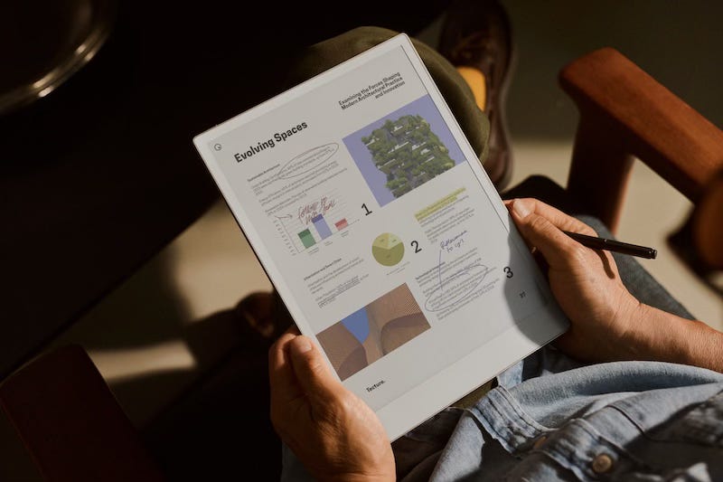
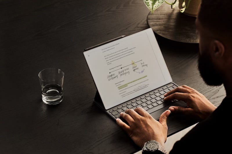
Yesterday (4th September 2024) saw the announcement and release of the reMarkable Paper Pro, launched with a fancy video and an interview with the remarkable founder - Magnus Wanberg.
I had no idea this thing was coming! I’d heard nothing on social media, so this was a massive surprise to those who don’t have a ‘special relationship’ with the company (those who get early access to products). But what I saw on that video had me dashing to a browser and tapping the BUY button as soon as possible, as apparently, the Paper Pro will be limited in supply—at least for the moment. As soon as I get this thing in my hands, I’ll unbox it, take an in-depth look, and post my experience here, on my website and YouTube channel.
While I don’t have the device in my hands yet, there’s so much to unpack regarding the new features that I just had to share my thoughts about it, particularly since it seems to have answered one of my major criticisms of the reMarkable 2. So, in this article, I will break down what makes this new model different from its predecessors and whether it might be the digital paper tablet we’ve all been waiting for!
The Basics
The reMarkable Paper Pro is the newest addition to the reMarkable family, and it has a starting price of £559 ($579), but this rises steeply up if you start to add in all the accessories available: the Marker, the keyboard, and the folio case. It’s positioned as a premium device, and it’s clear that reMarkable has packed this model with features that aim to justify that initial price tag. The most striking upgrade is its 11.8-inch E Ink Gallery 3 screen, an increase in size from 10.3 inches of the reMarkable 2. This E Ink Gallery 3 is what the underlying E Ink colour display technology is called; however, to keep it sounding cool and more marketable, reMarkable is calling this its ‘Canvas Color’. Unlike other colour E Ink models that rely on a colour filter to simulate colour, this screen has actual coloured micro-pixels, supposedly offering a much more vivid and accurate display with a crisp resolution of 229 ppm. This sounds like a massive step up from the pastel-like and unsaturated colours from a Boox colour tablet such as the Note Aire 3C, making the Paper Pro a strong contender in the digital note-taking market.
A Backlight
This feature immediately caught my eye: the addition of a front-lit display. This is, for me, a game-changer. One of my biggest gripes with the reMarkable 2 was the lack of a backlight, which made it useless in low-light conditions. This new addition (which other digital note-taking devices have had for a long time) addresses that issue head-on. Whether you’re working late at night or sitting in a dimly lit room, you’ll be able to see the screen clearly without straining your eyes. You’ll also be able to adjust the brightness to your liking, giving you complete control over the light level. Honestly, the lack of a backlight on the reMarkable 2 was the main reason I returned it all those months ago. I recorded a video about that experience, which you can watch HERE.
New E Ink Gallery 3 Screen (Canvas Color)
It’s not just about having colour on your E Ink device; it should be more about having real, natural-looking colours, and this is possible on the Paper Pro thanks to the use of coloured micro pixels rather than a colour filter layer. You’ll be able to choose from several base colours and blend them to create up to 20,000 different shades! This is a huge leap forward for anyone who enjoys digital art, loves adding colourful annotations to documents, or simply wants a more engaging note-taking experience. If you’ve watched my Boox videos or read my Boox articles, you’ll know that I appreciate the colours on this device despite them looking pasty and unsaturated, and you should also know that I would love Amazon to release a colour Kindle Scribe, so maybe when I get my hands on reMarkable Paper Pro, my head may be well and truly turned.
Enhanced Performance and Speed
For those of you who like reading about stats - The Paper Pro comes with a 1.8 GHz quad-core processor and 2GB of RAM, which should make it noticeably snappier than the reMarkable 2. The company have also said there will be less latency when writing or drawing—down to just 12 milliseconds from 21 milliseconds! Which is impressive, quite frankly. It should feel a lot closer to writing on paper than it has ever been. They’ve also reduced screen glare by 15%, which should make it easier to use in various lighting conditions.
The Paper Pro also features some solid upgrades in terms of storage and connectivity. With 64GB of internal storage, you’ve got plenty of room for all your notes, sketches, and documents. For those worried about cloud syncing or downloading files, dual-band WiFi support ensures a faster and more stable connection. Plus, the ever-reliable USB-C port will allow for faster charging and greater compatibility with other devices.
Stylus Options
A good note-taking experience is nothing without a great stylus, and reMarkable is giving us choices here. The new basic Marker is lighter and magnetically attaches to the tablet. But the Marker Plus is where things get interesting—it’s got a built-in eraser and tilt recognition for more natural shading, much like you would have with a real pencil. Perfect for sketching, calligraphy, or any kind of creative work where precision and detail matter.
Accessories
In addition to the stylus options, reMarkable has also introduced some new folios and cases. There’s the Book Folio, available in a variety of materials like leather and mosaic weave, which offers auto wake-up features and a magnetic Marker strap. And these folios come in multiple colour options, adding a touch of personalisation to your digital notebook. Then there’s the Type Folio for those who want a physical keyboard, which is great for typing out longer documents directly on the device.
The New Connect Subscription Model
reMarkable are obviously wanting to push their Connect subscription model. Starting at £2.99 ($2.99) a month after a free 100-day trial, this service gives you unlimited cloud storage, automatic sync, and exclusive offers. I think this is a fair price for anyone who wants to ensure their data is safely backed up and accessible across multiple devices. What do you think? Should this be something you get for free, considering the price of the device, or at least get 12 months covered so you can really stretch the cloud-syncing legs?
Who is it for?
I think it’s ideal for anyone who loves the feel of paper but wants the flexibility of digital. Basically, it is for anyone who has previously bought into the digital note-taking world! I think the addition of a colour screen and the new backlit display addresses some issues that folks like me may have had with the previous models.
The thing I did appreciate about the reMarkarble 2, just like the Kindle Scribe, is its simplicity of use and limited options. This ‘limitedness’ compared to, say, the Boox tablets, which have a veritable web of menus within menus, customisation upon customisation, is a strength for those who just want to get work done and not get caught up in distractions.
Final Thoughts
Overall, the reMarkable Paper Pro looks like a significant upgrade over its predecessors. I’m genuinely excited to see how it performs in real-world use, and I can’t wait to test it out myself. It’s ordered and on its way—let’s see if it can replace Amazon’s Scribe as my E Ink note-taking device of choice.
So, what do you think? Are you a reMarkable 2 user, and are these new features enough for you to upgrade? Or is this making you consider getting your first reMarkable?
Subscribe to this Substack (if you’re not already) or pop over and subscribe to my YouTube channel, as I don’t think you’ll want to miss my full review when the device finally arrives!
Connect with me here: X | YouTube | Instagram | Threads
Subscribe to my YouTube channel: The Spark
Gift me a virtual coffee: BuyMeACoffee
Buy stuff: Affiliate Page


